Adopter Experience 👥
Introduction 📖
Hello and welcome, adopters! 🌟
In this section, we will provide you with a comprehensive overview of the Adopter Experience for the application. Whether you are a user, tester, or stakeholder, this documentation aims to familiarize you with the functionalities, features, and benefits of our application from an adopter's perspective.
Table of Contents
- User Journey Overview 🚀
- Application Features and Usage 🌟
User Journey Overview 🚀
As an adopter of the application, your journey starts here. This section will guide you through the process of getting acquainted with the application and utilizing its features to meet your goals.
Application Features and Usage 🌟
Our application offers a range of features designed to enhance your experience and productivity. From managing user interactions to accessing valuable insights, you'll find everything you need to achieve your objectives. Dive into our user-friendly interface, engage in meaningful conversations, and explore the power of intelligent automation.
URLs Configuration and Environment Setup
Accessing urlsConfig
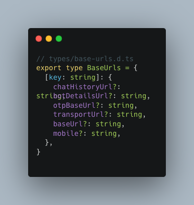
The urlsConfig can be accessed from the config folder in the apps/uci/web directory,specifically in the config folder in a file named urls_config.ts. The BaseUrls type, used in the configuration, is defined in a separate file located in the types folder of the directory. Here's how the BaseUrls type is defined in the base-urls.d.ts file:
Setting the Environment:
The environment variable determines whether you're in a development or production environment. This variable is fetched from the NEXT_PUBLIC_ENVIRONMENT environment variable, which is configured in the apps/uci/web directory scripts within the package.json file. Here's how it's set up for a TurboRepo configuration:
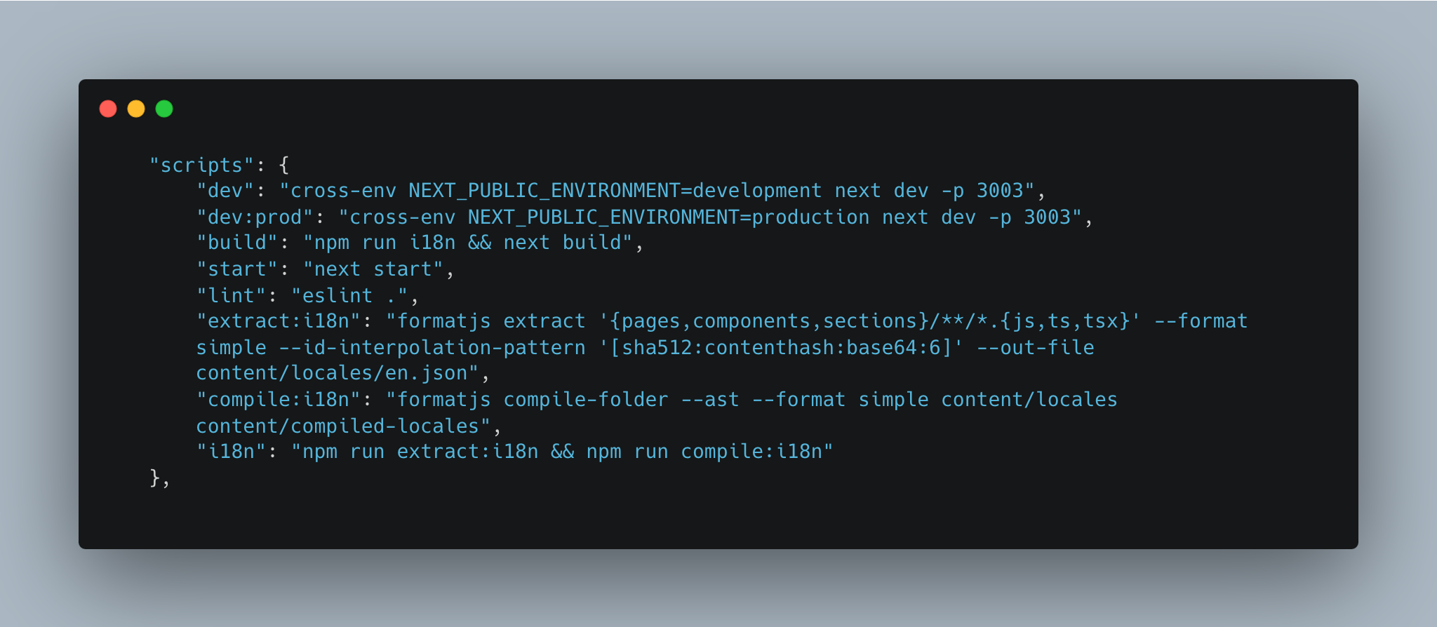
In the scripts section of package.json, you can see that the NEXT_PUBLIC_ENVIRONMENT variable is set explicitly when running the development (dev) and production (dev:prod) scripts using the cross-env utility.
When you run npm run dev , it sets the environment to 'development'.Similarly,when you run npm run dev:prod, it sets the environment to 'production'.
URLs Configuration:
In the urls_config.ts file,each URL corresponds to a specific API endpoint or service. Here's an explanation of each URL and how users can customize them:
transportUrl: This URL is used for establishing a WebSocket connection, typically for real-time communication with the application.
chatHistoryUrl: This URL is used to fetch chat history data from a server.
baseUrl: This URL serves as the base URL for the application's main API endpoints.
botDetailsUrl: This URL is used for fetching details about a chatbot or related services.
otpBaseUrl: This URL is used for operations related to one-time passwords (OTPs) or authentication.
Users can customize the urls by simply setting environment variable in their development and production environments:
const baseUrls: BaseUrls = {
 development: {
     transportUrl: process.env.NEXT_PUBLIC_DEV_TRANSPORT_SOCKET_URL,
     chatHistoryUrl: process.env.NEXT_PUBLIC_DEV_CHAT_HISTORY_URL,
     baseUrl: process.env.NEXT_PUBLIC_DEV_UCI_BASE_URL,
     botDetailsUrl: process.env.NEXT_PUBLIC_DEV_UCI_BOT_BASE_URL,
     otpBaseUrl: process.env.NEXT_PUBLIC_DEV_OTP_BASE_URL
 },
 production: {
     transportUrl: process.env.NEXT_PUBLIC_PROD_TRANSPORT_SOCKET_URL,
     chatHistoryUrl: process.env.NEXT_PUBLIC_PROD_CHAT_HISTORY_URL,
     baseUrl: process.env.NEXT_PUBLIC_PROD_UCI_BASE_URL,
     botDetailsUrl: process.env.NEXT_PUBLIC_PROD_UCI_BOT_BASE_URL,
     otpBaseUrl: process.env.NEXT_PUBLIC_PROD_UCI_OTP_BASE_URL
 },
};To customize these URLs:
Development Environment: Users can define their custom URLs by setting environment variables in their development environment. For example, in a .env.local file or equivalent:
NEXT_PUBLIC_DEV_TRANSPORT_SOCKET_URL=http://localhost:3000/socket
NEXT_PUBLIC_DEV_CHAT_HISTORY_URL=http://localhost:3000/history
NEXT_PUBLIC_DEV_UCI_BASE_URL=http://localhost:3000/api/v1
NEXT_PUBLIC_DEV_UCI_BOT_BASE_URL=http://localhost:3000/bot
NEXT_PUBLIC_DEV_OTP_BASE_URL=http://localhost:3000/otpProduction Environment: For the production environment, users can similarly define their custom URLs by setting environment variables specific to the production environment:
NEXT_PUBLIC_PROD_TRANSPORT_SOCKET_URL=wss://api.example.com/socket
NEXT_PUBLIC_PROD_CHAT_HISTORY_URL=https://api.example.com/history
NEXT_PUBLIC_PROD_UCI_BASE_URL=https://api.example.com/api/v1
NEXT_PUBLIC_PROD_UCI_BOT_BASE_URL=https://api.example.com/bot
NEXT_PUBLIC_PROD_OTP_BASE_URL=https://api.example.com/otpAccessing URLs Based on Environment:
To effectively use the urlsConfig in the application code and access URLs based on the environment, follow these steps:
Import urlsConfig:
In your application code, start by importing the urlsConfig object from the urls_config file. Ensure that you've set up this import correctly:
// Import the urlsConfig
import { urlsConfig } from '@/config/urls';This import statement allows you to access the URLs defined in the configuration.
Access Specific URLs:
Once you've imported urlsConfig, you can access specific URLs for the application. Use the following examples:
Accessing chatHistoryUrl:
const chatHistoryUrl = urlsConfig?.chatHistoryUrl;Accessing botDetailsUrl:
const botDetailsUrl = urlsConfig?.botDetailsUrl;
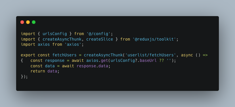
Example :
userListSlice.tsx
Environment Console Logs:
- After setting up
urlsConfig, you can log the chosen environment and the corresponding URLs usingconsole.log(environment)andconsole.log(urlsConfig).
- After setting up
Switching Environments:
- When switching between development and production environments, update the
NEXT_PUBLIC_ENVIRONMENTenvironment variable in your deployment settings. - The application will automatically use the correct URLs based on the environment.
- When switching between development and production environments, update the
By effectively utilizing the urlsConfig, you'll be able to effortlessly manage API endpoints and services across different environments. This ensures a seamless experience for both development and production scenarios, making your interactions with the application more efficient and reliable.
Note: It's important to ensure that your environment variables are correctly set up in your development and production environments for this feature to work as intended.
Configuration Management with config
The config feature empowers you to centralize and manage various visual and functional aspects of the application in a single place. This includes settings for UI elements, icons, styles, URLs, and more. With the config object, you can effortlessly tailor your application's look and behavior without digging deep into the codebase. Let's dive into how to utilize and extend the config feature:
Accessing
config: The config can be accessed from the config folder in the apps/uci/web directory,specifically in the config folder in a file named config.ts.Configuration Structure:
- The
configobject is organized into different sections, such assocket,list,starredlist,heading,tab,icon,search,chatList,chatItem,message, andchatWindow. - Each section contains sub-settings to customize specific aspects of your application.
starredlist:
- video_cover: This property defines the video cover image for the starred list.
sideBar:
- visible: Indicates whether the sidebar is visible. In this case, it's set to 'false,' which likely means the sidebar is hidden by default.
search:
- placeholder: The text to display as a placeholder in the search input.
- padding, icon, iconPadding, outline, border, and borderRadius are styles and properties related to the search input.
tab:
- margin and borderRadius control the styling of tabs.
- bots.text: Text to display on the "Bots" tab.
- Starredchat.text: Text to display on the "Starred Chat" tab.
chatList:
- width, height, overflow, and margin define styles for the chat list container.
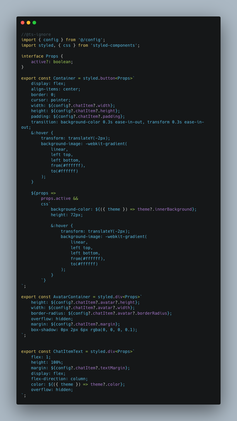
chatItem:
- margin, textMargin, height, width, padding, and avatar properties control the styling of each chat item within the chat list.
- avatar properties specify the styling for the chat item's avatar image.
message:
- icon: The bot's icon image.
- userImage: Configuration for the user's image, including its source, dimensions, and border radius.
- iconSize: Size of icons in messages.
- userInput, botMsg, and listItem are configurations related to user input, bot messages, and list items within chat messages.
chatWindow:
- margin, borderRadius, and innerWindow properties control the chat window's overall styling.
- topbar contains styling and properties for the chat window's top bar, including icons, text, and images.
- window defines styling for the chat window itself.
textInput:
- borderRadius, padding, margin, and sendIcon are properties related to the text input field for sending messages.
- The
Modifying Existing Settings:
- To adjust an existing setting, locate the appropriate section and change the desired properties.
- For example, to change the text color of the chat icon, find the
iconsection and update thecolorSchemeproperty.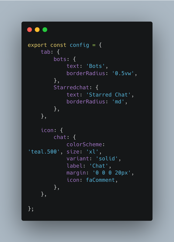
Adding New Components:
- You can introduce new UI components to the
configobject. - Define a new section, such as
newComponent, and configure its properties. -Here's how to utilize and extend the config feature effectively:
Accessing the config Object
Firstly, ensure that you import the config object from the config.ts file inside the config folder, which you can access like this:
import { config } from '@/config/config';Applying config Settings in Styled-Components
Now, let's explore how to leverage the config settings within styled-components, making the styling process seamless and modular. For instance, let's create a styled button component using config properties:
import styled from 'styled-components';

// Define a styled component using config properties
export const StyledButton = styled.button`
 background-color: ${config.button.backgroundColor};
 color: ${config.button.textColor};
 border: ${config.button.border};
 border-radius: ${config.button.borderRadius};
 padding: ${config.button.padding};
 font-size: ${config.button.fontSize};

 &:hover {
     background-color: ${config.button.hoverBackgroundColor};
 }
`;Using the Styled Component in the Components
Having created a styled component using config properties, you can now seamlessly incorporate it into your components. Here's an example of how you can use StyledButton within your component:
import React from 'react';
import { StyledButton } from './StyledComponents'; // Update the import path

const MyComponent = () => {
 return (
     <div>
         <StyledButton>Click me</StyledButton>
     </div>
 );
};
export default MyComponent;Customizing config for Your Needs
To make the most of the config feature, you can tailor the settings according to the requirements. For instance, you can modify properties like button.backgroundColor, button.textColor, button.border, and more to align with the desired styles:
// config.ts
export const config = {
 button: {
     backgroundColor: 'blue',
     textColor: 'white',
     border: 'none',
     borderRadius: '5px',
     padding: '10px 20px',
     fontSize: '16px',
     hoverBackgroundColor: 'darkblue', // Customize hover color
 },
 // ... other config properties
};- You can introduce new UI components to the
Extending the
config:- As the application evolves, feel free to extend the
configobject with new sections and properties as needed.
Adding New Sections to config
To cater to new functionalities or UI components, you can introduce entirely new sections within the config object. For instance, if you're adding a section for a "Notification Bar," you can proceed as follows:
// Extend the config object with a new "notificationBar" section
config.notificationBar = {
 backgroundColor: '#FF5733',
 textColor: '#FFFFFF',
 icon: 'bell', // Icon name or path
 // Add more properties as needed
};By following this approach, you've created a dedicated section within config to manage the styling and behavior of your Notification Bar.
Configuring New Properties
Within each new section, you can define specific properties that cater to the requirements of your application. For instance, in the "notificationBar" section, you can set properties like backgroundColor, textColor, icon, and any other relevant attributes.
// Example of extending the "notificationBar" section
config.notificationBar = {
 backgroundColor: '#FF5733',
 textColor: '#FFFFFF',
 icon: 'bell', // Icon name or path
 // Add more properties as needed
};Accessing Extended config Properties
Once you've extended the config object, accessing the newly added properties is straightforward. Simply reference them using dot notation within your application code. For instance, to apply the background color of the Notification Bar:
// Access and apply the Notification Bar background color
const notificationBarBackgroundColor = config.notificationBar.backgroundColor;Example
chat-item/styled.ts
- As the application evolves, feel free to extend the
Note: While configuring the settings in config, be mindful of any dependencies or libraries used within your application to ensure seamless integration.
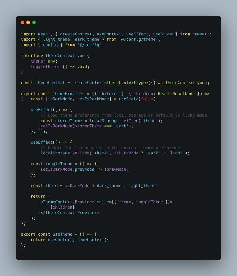
Global Theme Management and Dark Mode 🎨
Maintaining a consistent and visually appealing user interface is crucial for any application. The project provides a robust global theme management system that includes support for a dark mode. This allows you to seamlessly manage the appearance of the application and provide a better user experience.
Theme Configuration
The theme configuration is organized into a dedicated file, theme.ts(config folder), where you can customize various design elements to create a visually consistent application.
Here are the key components of the theme configuration:
dark_theme: Defines the properties for the dark mode. It specifies background colors, font colors, and other visual elements that contribute to a cohesive dark mode experience.light_theme: Specifies the properties for the light mode, including background colors, font colors, and shadows.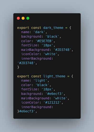
Using the Theme Provider
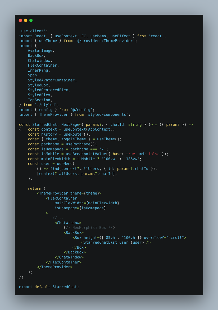
We've implemented a ThemeProvider component that encapsulates the logic for theme management, including toggling between light and dark modes.
Installation:
To start using the theme provider, import it into your component file:
import { ThemeProvider, useTheme } from '@/providers/ThemeProvider'; // Update the path as needed
Implementation:
Wrapping a Specific Component with ThemeProvider
Wrap the specific component or component tree that needs the theme with the ThemeProvider. For example, if you want to apply the theme to a component called MyComponent, do it like this:
const MyComponent =()=> {
 const { theme, toggleTheme } = useTheme();

 return (
    <ThemeProvider theme={theme}>
     <Div>
         {/* Your component's content */}
        <button onClick={toggleTheme}>Toggle Theme</button>
     </Div>
   </ThemeProvider>
   );
}Using styled-components
import { Box } from '@chakra-ui/react';
import styled from 'styled-components';

export const Div = styled.Box`
 color: ${({ theme }) => theme.color};

 @media (max-width: 768px) {
     margin-left: 20px;
  }
`;
Example:
starred-chats/page.tsx
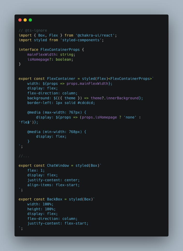
starred-chats/styled.ts
In this example, you import the useTheme hook and use it to retrieve the current theme and the toggleTheme function. You can then apply the theme's background and font colors to your component.
Customizing Theme Colors and Using Local Storage 🎨
Our global theme management system provides flexibility for adopters to customize the colors of the theme in both light and dark modes. Additionally, we utilize local storage to store and remember user preferences for the selected theme mode.
Customizing Theme Colors
To customize theme colors for both light and dark modes, follow these steps:
Open the
theme.tsfile in your project.Locate the
dark_themeandlight_themeobjects. These objects contain properties that define colors, backgrounds, and other visual elements for their respective modes.Updating these properties will update the color values within the theme objects to your desired hex codes or color names. For example:
 export const dark_theme = {
     // ...
     background: '#1E1E1E', // Update to your desired color
     color: '#FFFFFF',     // Update to your desired font color
     // ...
 };

 export const light_theme = {
     // ...
     background: '#FFFFFF', // Update to your desired color
     color: '#333333',     // Update to your desired font color
     // ...
 };
Importance of Theme Management
Consistent theming not only enhances the visual appeal of your app but also provides a seamless experience for users. Users can choose between light and dark modes based on their preference and lighting conditions.
Feel free to customize the theme properties in the theme.ts file to align with your application's branding and design guidelines.
Using ESLint, Prettier, and Husky for Code Consistency ✨
Maintaining consistent code quality and style is essential for collaborative development. We've integrated ESLint, Prettier, and Husky into our project to help you achieve code consistency effortlessly.
Setting Up ESLint and Prettier
1.Installation:
- ESLint, Prettier, and other related packages are already listed in your
package.jsonunderdevDependencies. - Run
npm installto ensure all dependencies are installed.
2.Configuration Files:
- ESLint: Configure ESLint rules in
.eslintrc.js. - Prettier: Customize Prettier formatting options in
.prettierrc.js.
- Running ESLint and Prettier:
- Use
npm run lintto run ESLint and catch linting errors. - Use
npm run formatto apply Prettier formatting to.ts,.tsx, and.mdfiles.
- Use
Running Lint and Format Scripts
We've set up two scripts to help you maintain code consistency:
Linting (
npm run lint):- When you run
npm run lint, ESLint will analyze your code for potential errors, style violations, and adherence to coding standards. - The main ESLint configuration file is located in the root of your project. It establishes global rules and settings.
- When you run
Formatting (
npm run format):- Running
npm run formattriggers Prettier to automatically format.ts,.tsx, and.mdfiles according to the configuration in.prettierrc.js. - Prettier enforces a consistent code style, such as indentation, line breaks, and more.
- Running
ESLint Configuration for Different Directories
Our project follows a modular structure, and each directory might have specific coding standards. To accommodate this, we have individual ESLint configurations for each directory. These configurations can be found within the respective directories.
When you run npm run lint, ESLint will consider both the root configuration and any specific configurations in subdirectories. This ensures that your code adheres to the appropriate coding standards throughout the entire project.
For example:
- The root
.eslintrc.jsfile contains global rules that apply to the entire project. - In the
apps/uci/webdirectory, you will find an.eslintrc.jsfile with rules tailored to the specific app. - Similar
.eslintrc.jsfiles will be present in other directories, such aspackages/*andtsdx/*.
Automating Code Consistency Checks with Husky
Pre-Commit Hooks:
- Husky enables you to define actions that run automatically before commits are made.
- Inside the
.huskyfolder, you'll find a pre-commit hook file (e.g.,pre-commit) that triggers linting and formatting checks before every commit.
Customizing Pre-Commit Hooks:
- To add new pre-commit hooks, create additional executable files inside the
.huskyfolder. - For example, create a file named
pre-commit-newhookand add your desired actions, like running tests or additional linting tasks.
- To add new pre-commit hooks, create additional executable files inside the
Enforcing Consistency:
- When you attempt to make a commit, Husky will run the pre-commit hooks.
- If any hook fails (e.g., ESLint finds issues or Prettier formatting is incorrect), the commit will be blocked, prompting you to fix the issues before proceeding.
Further Customization and Resources
Adding More Hooks:
- Expand your
.huskyfolder to include hooks for additional checks, like testing, security scans, or documentation validation.
- Expand your
Learn More:
- Dive deeper into ESLint and Prettier configurations by referring to their official documentation:
- ESLint: Official Documentation
- Prettier: Official Documentation
- Explore Husky's capabilities in its official documentation: Official Documentation
- Dive deeper into ESLint and Prettier configurations by referring to their official documentation:
Now, you can focus on writing code while Husky and our consistent code tools take care of maintaining clean and formatted code automatically.